A look into Coronavirus data. The data set used comes from https://data.humdata.org/

Charts with and without China.


Original concept video

A look into Coronavirus data. The data set used comes from https://data.humdata.org/
Charts with and without China.
Original concept video
Watch Cook County Grow over time!
Northern Triennial Townships. Residential Property Age visualized over time. Data ranges over 100 years. Data Source datacatalog.cookcountyil.gov
Assessment dataset used by the Cook County Assessor in their Computer Assisted Mass Appraisal (CAMA) system used to assess residential properties in Northern Triennial Townships.
[1821×727]

[1813×719]

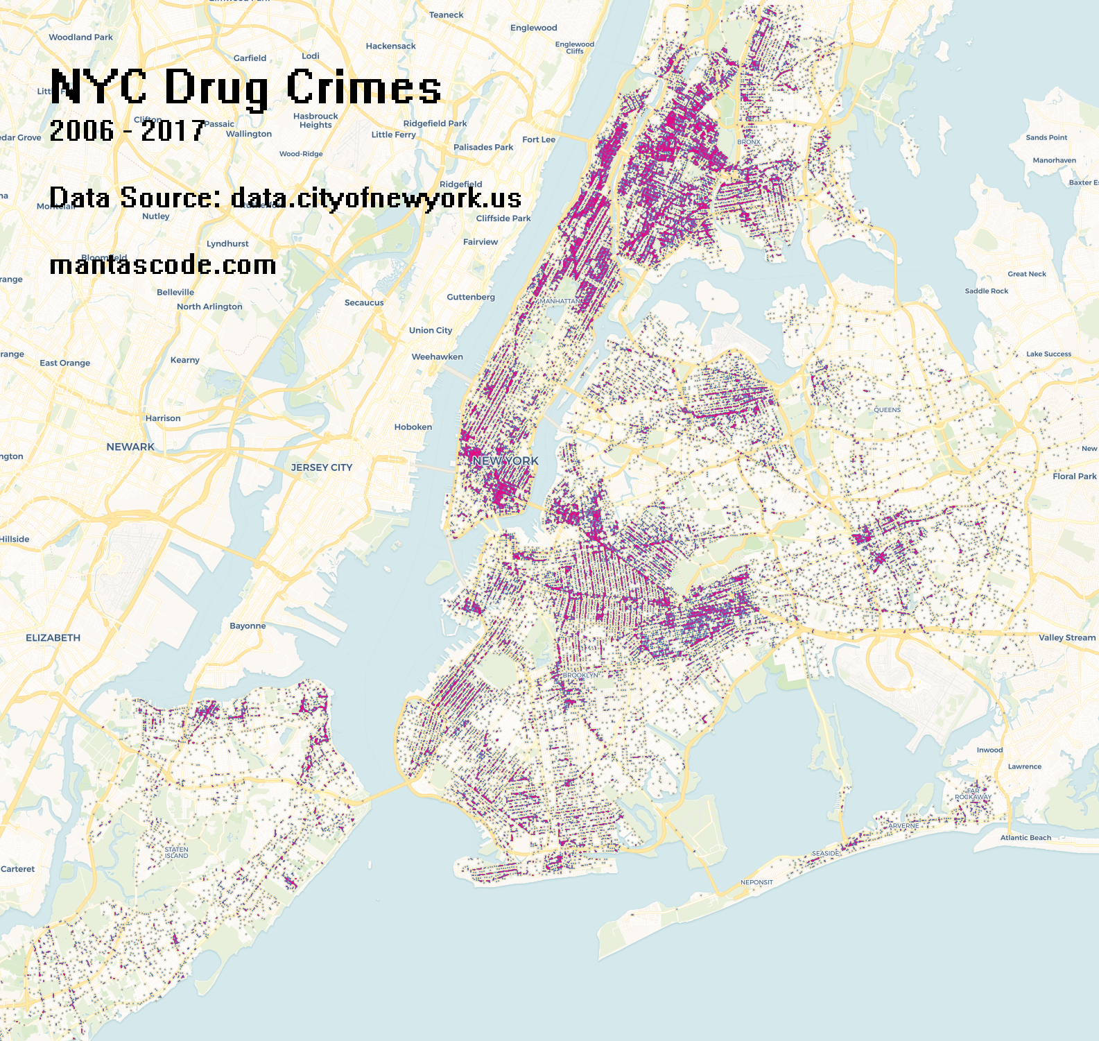
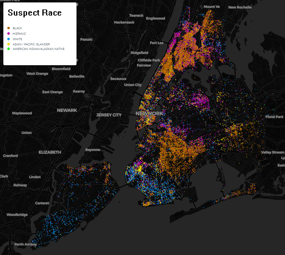
The data is collected by the New York Police Department. It can be found here data.cityofnewyork.us. To create the maps below, the dataset titled “NYPD Complaint Data Historic” was filtered down by the calcification of “Dangerous Drugs”. Carto was used to render maps.
[1261×341] Point map of incidents with screening. Click to enlarge.
[1585×1501] Heat map of incidents. Click to enlarge.
[935×837] Categorical point map by suspect’s race. Click to enlarge.
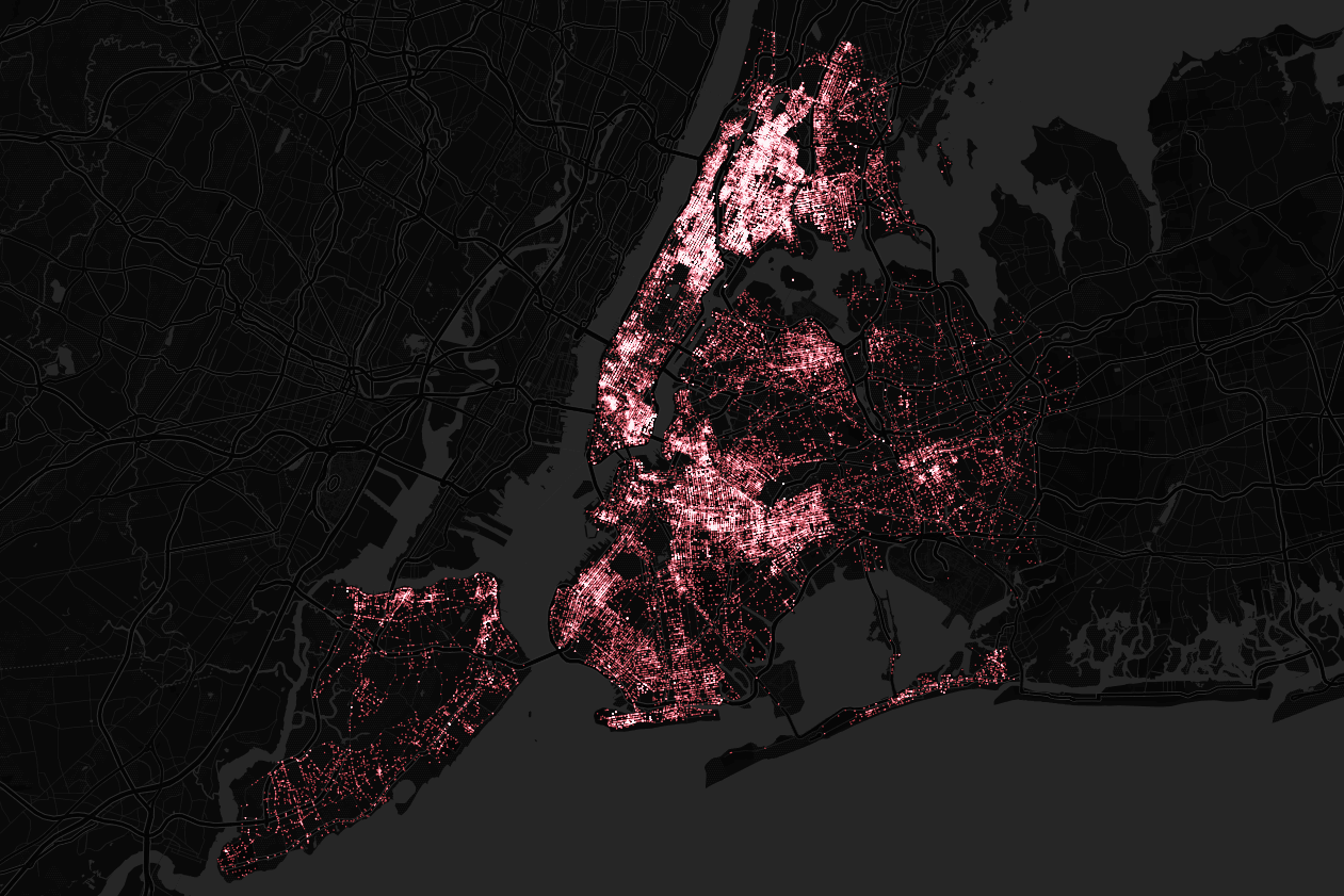
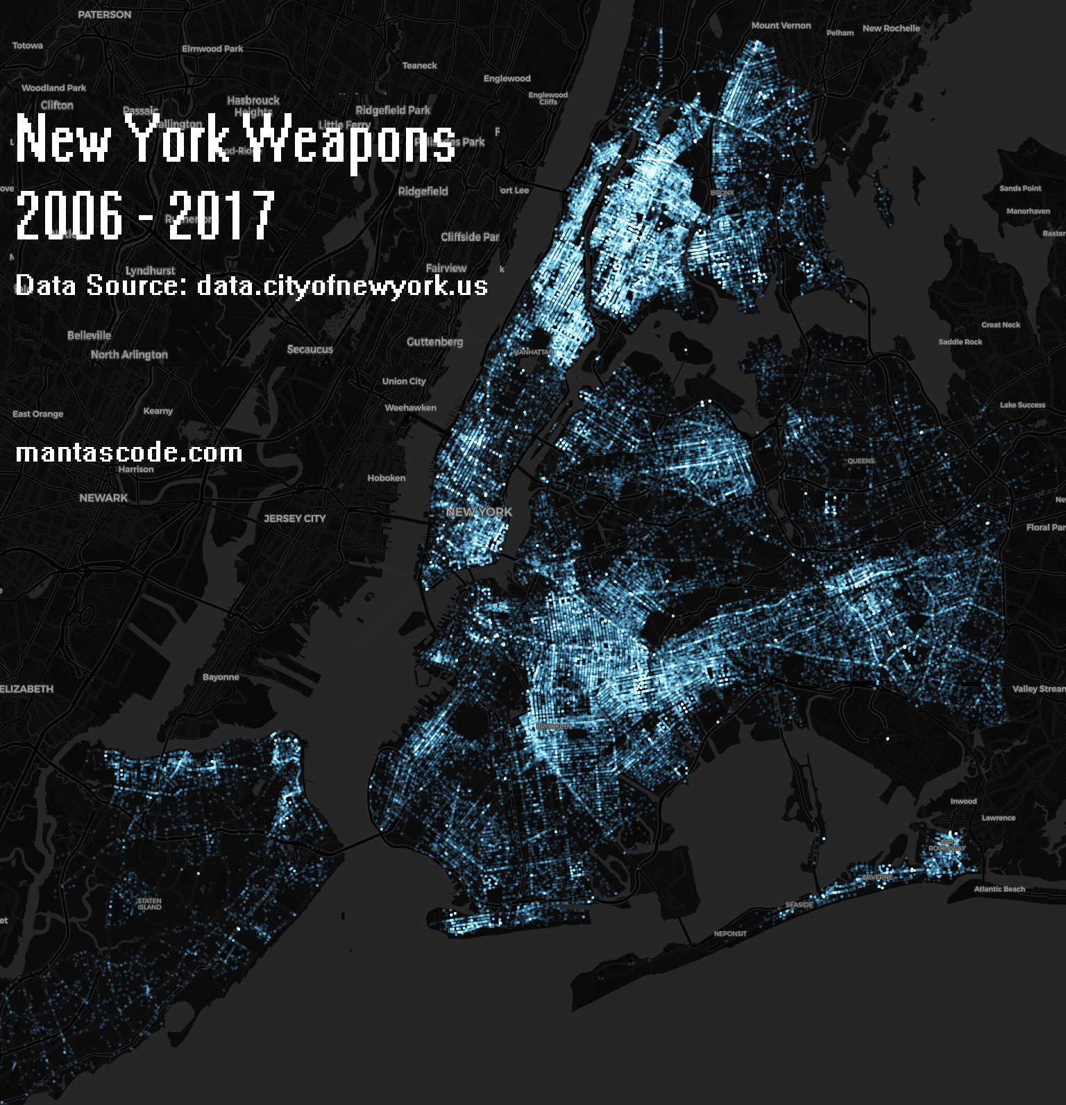
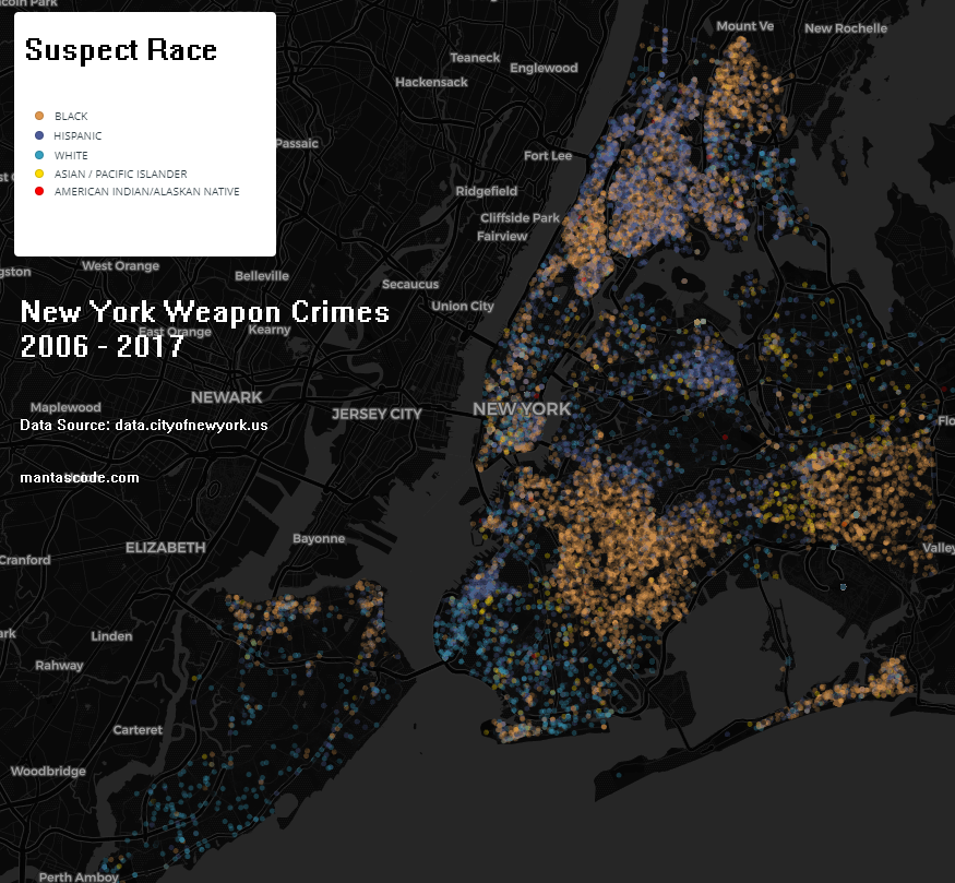
A quick look into New York’s weapon crimes from data.cityofnewyork.us
This dataset includes all valid felony, misdemeanor, and violation crimes reported to the New York City Police Department (NYPD)
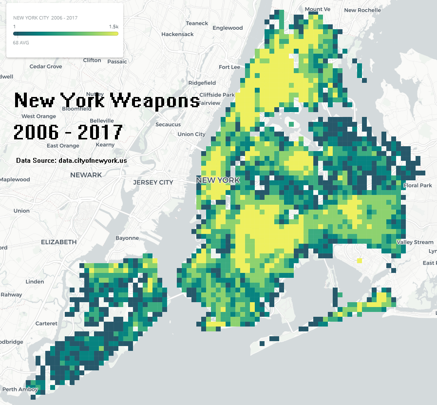
[1536×1592] Click to enlarge, point map. 141,860 incidents.
[875×809] By suspect race.
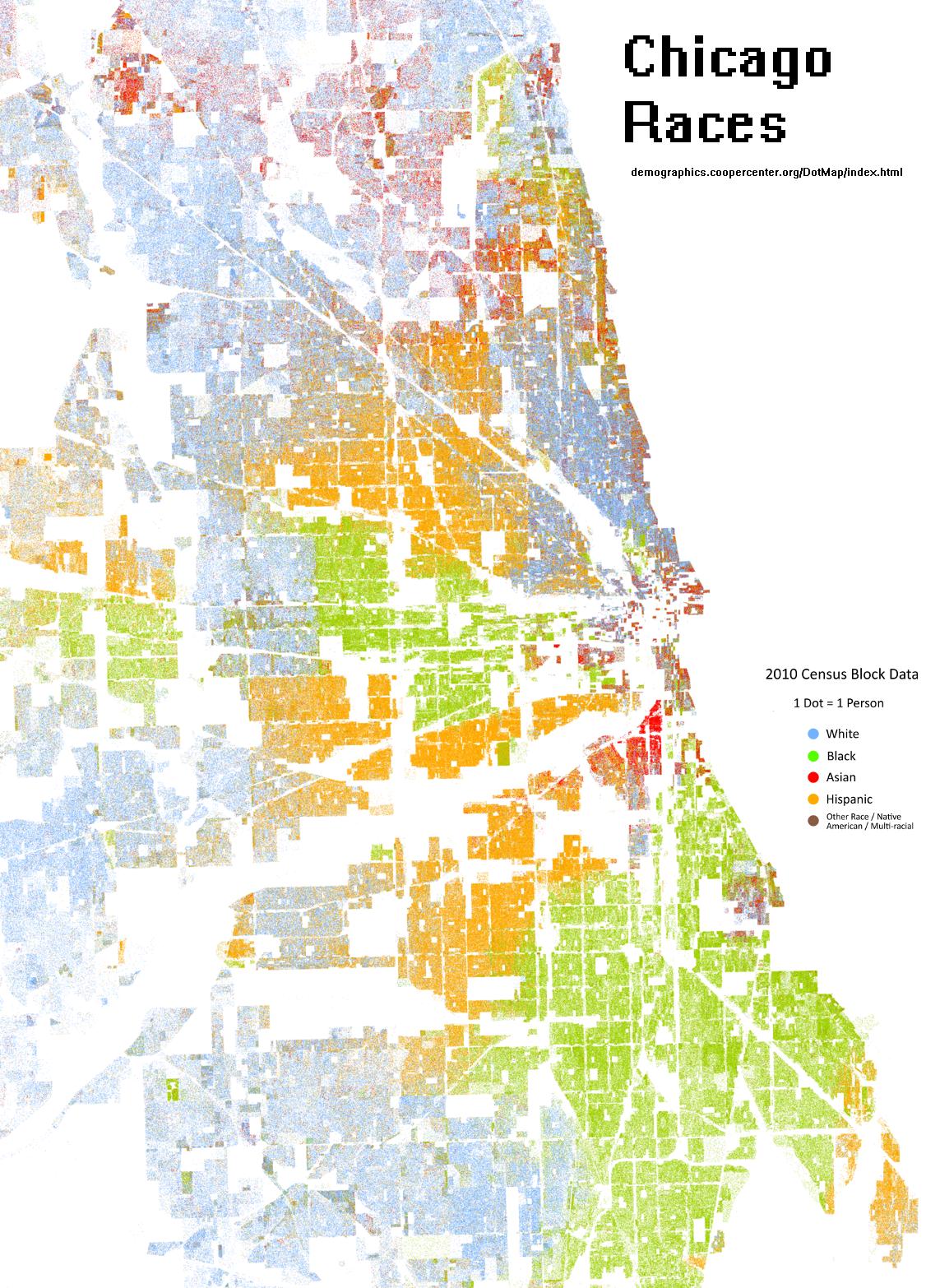
Mapping a collection of knife crimes in Chicago.
Date range spans from 2010 through 2019. The data comes from data.cityofchicago.org, and is collected by the Chicago Police Department (reported incidents of crime).

I made some animations of crystallographic defect formations using equilateral spheres. Point defects, lattice regions, and other interesting patterns can be seen forming in the video below. This was created using Blender’s rigid body physics system.


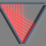
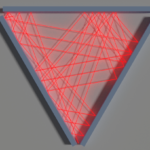
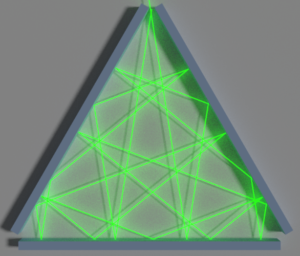
Below is an animation of a laser bouncing around a triangle with open vertexes. A link to the Euler problem can be found at projecteuler.net/problem=202. This is just a visualization of the problem. This post does not contain an answer, or any algorithms.
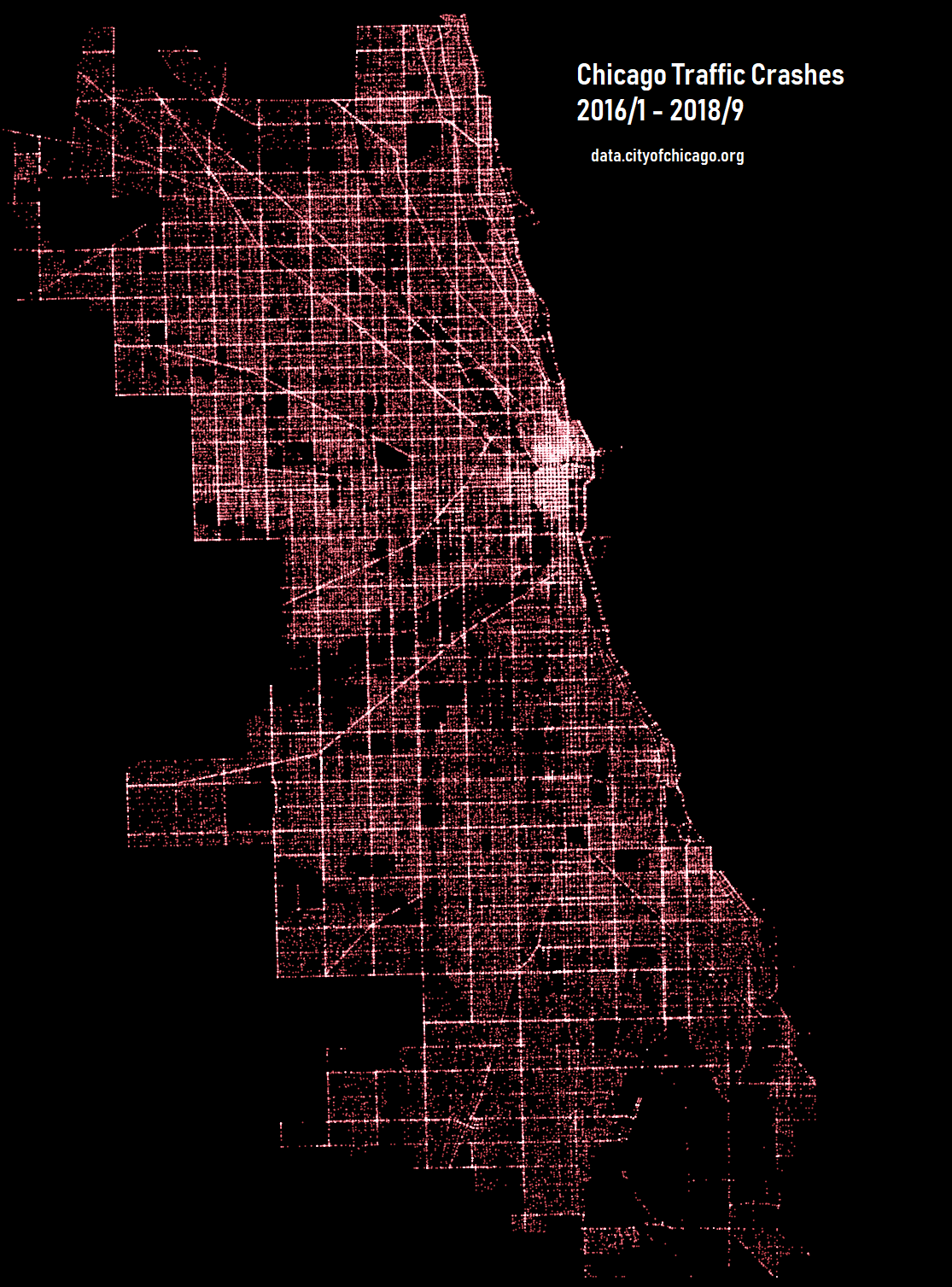
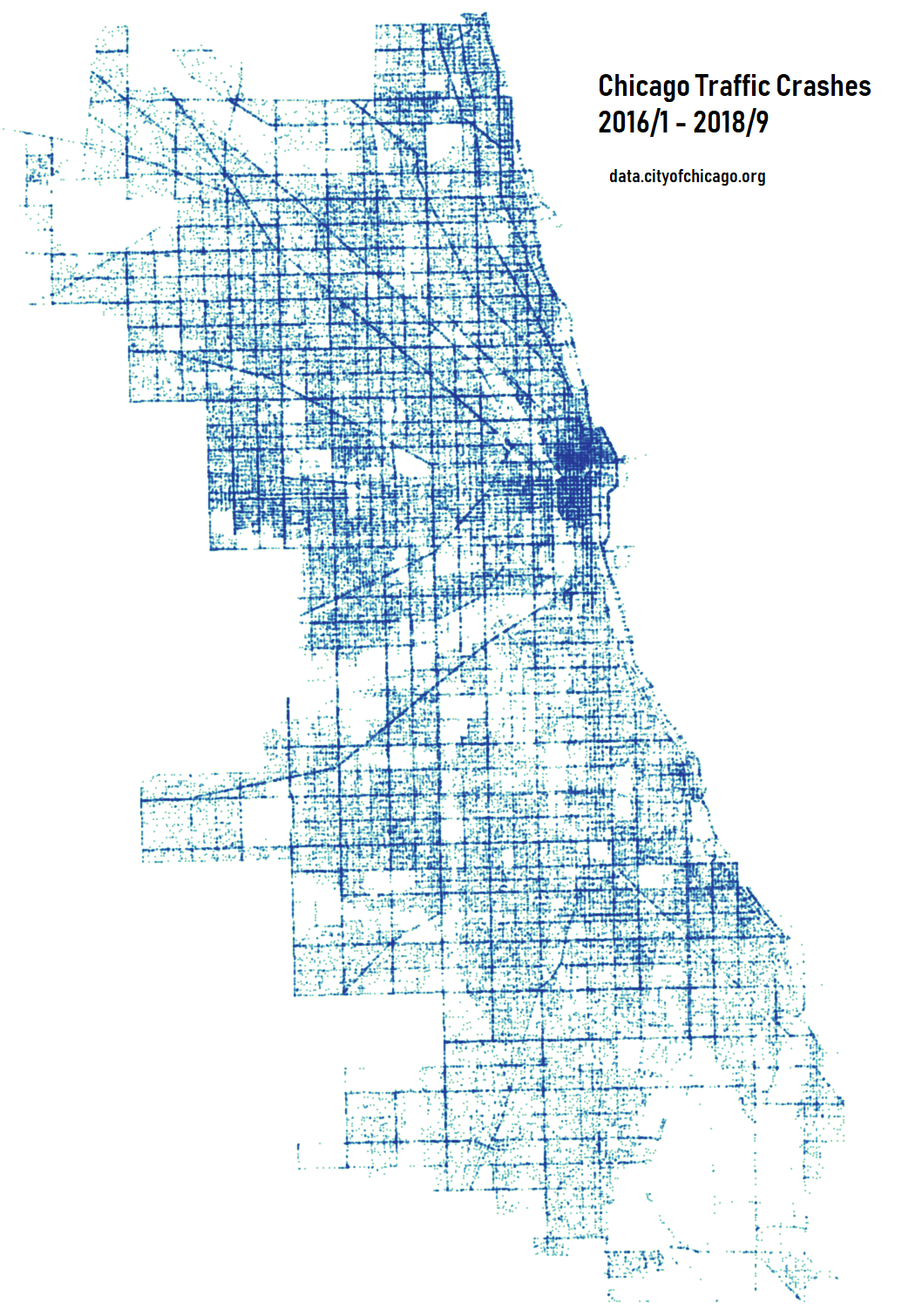
Point and heat maps of Chicago created by plotting coordinates of traffic crashes. Time range used, spans from January 2016 through September 2018. The data can be found at data.cityofchicago.org.
Crash data shows information about each traffic crash on city streets within the City of Chicago limits and under the jurisdiction of Chicago Police Department (CPD).
Click on map images below to enlarge.
I thought it would be interesting to see how specific subreddits are related to one another by their mods.
Here is an example of a single mod to many sub relationship.
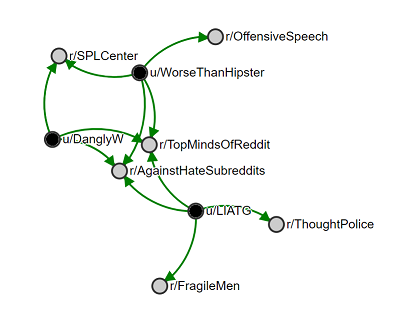
Three root subreddits where chosen: r/The_Donald, r/AgainstHateSubreddits, and r/TheBanOut2018. Below are wordclouds showing what other subreddits share the same mods as the root subreddit. The font size is the scale for how many mods from the root sub are in another sub. The larger the font, the more mods they share with the root sub. For AHS and TheBanOut2018 clouds a mod relationship less than 4 where filtered out.
Click on images below for higher resolution.


A visualization of gun related incident reports from the Chicago Police Department. Primary crime types of robbery, battery, and assault with the use of a handgun. Time range used 2010 through 2018. To get access to the data, visit here https://data.cityofchicago.org/